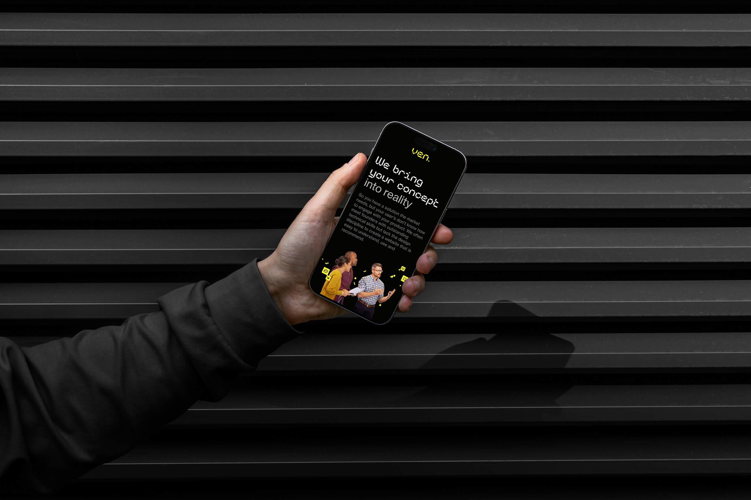
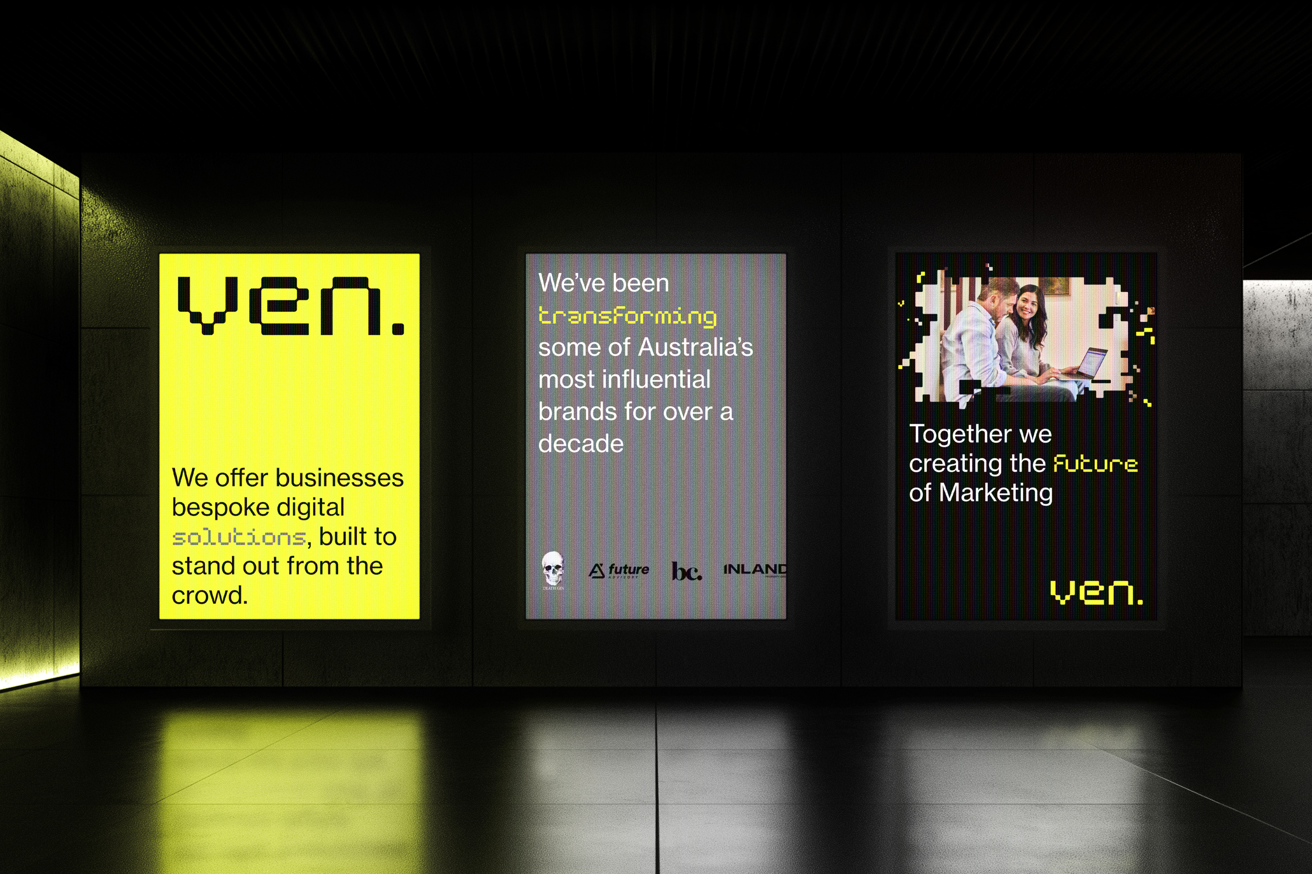
New logo and typefaces with neon colors
The old design, while highly experimental and distinctive, required a high level of design expertise and strong grid application skills. This sometimes put pressure on the marketing team, who often had to handle basic ad-hoc designs on their own.
The new brand direction focuses on a bold, striking design that makes an immediate impact while remaining easy to implement. The logo is the last component in the new design concept. The brand identity is developed with a digital font and a set of icons that align with the same style, all placed on a dark mode background—evoking the dark aesthetic from VEN’s early days.
Iconography
Concept
While I am not responsible for the design execution of branding items, this project plays a crucial role in shaping the direction for a full revamp of VEN’s branding.
*These are just the mockup concepts; the final products executed by VEN.’s designers may differ
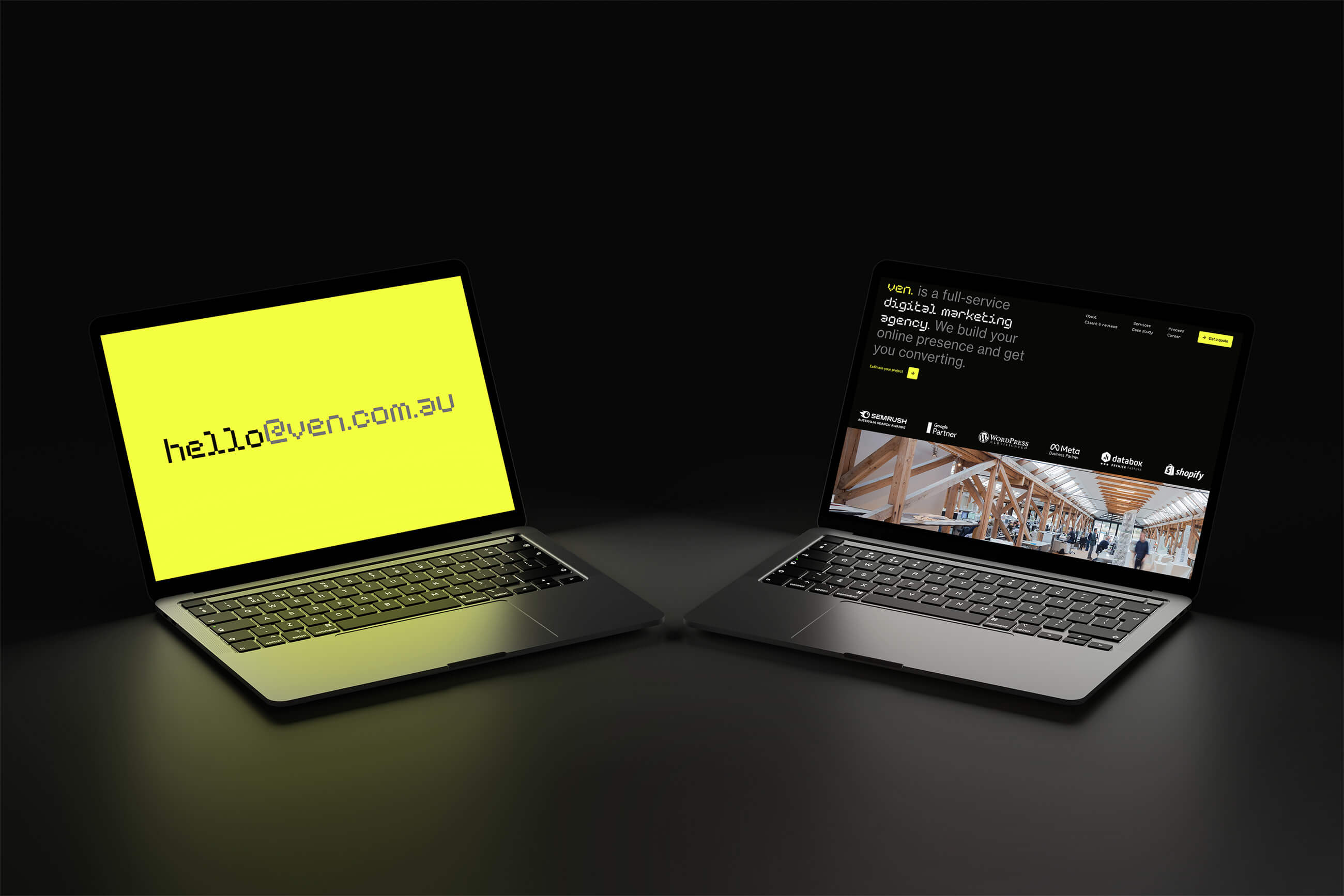
New strategy, new UI
A design direction and content structure that is more practical and less experimental.